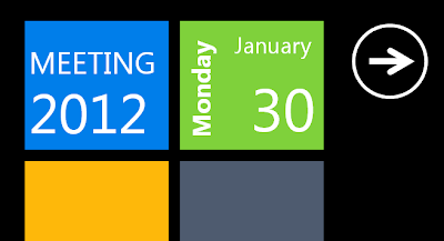
A couple of weeks ago, I had to do a presentation in my church highlighting a leadership transition that is happening. Since this presentation is more like an "announcement" instead of a "teaching" or "lecture", I thought I would try to craft a Power Point slides that resemble a Windows Phone's Metro UI.
I did some research about Metro design guidelines and found this MSDN article, this pdf, and a bunch more. MS Office 2007 or newer also already has "Metro" color scheme. Here are some highlights of the basic stuffs:
- Font: Segue UI, Segue UI light, Segue WP
- Use boxes for points (instead of bullet points)
- Intentionally cut title/header text to provide the illusion of panorama display
- Try to use slide transition that simulate "swipe"
- Need to use custom animation to simulate "scroll"
For the next slide, I tried to simulate a "Hub". Create an oversize hub-title, with some part of the text bleeds out to the right of the screen, giving the hint of more content to the right. This is basically a "list" view, the list title with all lower case and the list items with some small blurb for each one. The second list title is also position to the right to simulate the next list.
The last slide is basically a copy of the first slide, but with some added effects for "scroll up". So in the design view, the boxes go all the way down beyond the bottom edge of the slide. With custom animation, I simulate a "scroll up".
You can download the power point file here.


